I’m really interested in informal, immersive learning experiences.
I’m particularly interested in ways we can leverage cities, and the experience of living in and moving through one to enrich ourselves. We, as human sponges, are soaking up all kinds of information from our daily experiences, whether we intend to or not. Why not design those everyday experiences to expose us to things that might stretch our minds a little bit? or help us connect a little better with the space and people around us?
There are many streets in New York City with honorary names, in addition to their formal names. I’m always a little disappointed when I see a name on a street sign that I don’t recognize. In this age of handheld, internet-connected computers, I can obviously quickly look up the name, but it always seems like a missed opportunity not to have information on or near the street signs about the honoree.
And even if I look the person up, I still lose contextual information. I may find out why the person was significant to the world, broadly. But I don’t know what spurred people here, in this physical place, to co-name a street after that person. And I don’t know when that happened.
And in many cases, the person had local significance more than worldwide fame. Take Abrian Gonzalez Place, in Brooklyn. It’s hard to find much in a quick Google search about Abrian. And in fact, Google originally thought that perhaps I’d misspelled the name, and so showed me results for “Adrian Gonzalez,” as well, which wasn’t helpful.
Gilbert Tauber created a database of (most of) the NYC streets with honorary names, and information we have about their namings and namesakes. You can read more about the origin of the database over at the NY Times. Tauber’s database says only, “Abrian Gonzalez (1985-2006) attended P.S. 15, as a youth. He inspired the other students to stay away from crime and drugs”
Abrian clearly had significance to people in his community. It’d be great from a memorial standpoint, to have even that little blurb at the base of the signpost of Abrian Gonzalez Place.
And having that information somewhere in the actual physical location would help target learners (you know, passers-by) situate their learning.
At its most simple level, this could be just simply posting text. But it would be great if it could grow beyond that, into something more dynamic.
How might we help people currently, physically on a given co-named street have an active, living engagement with a community choice and context that may be many years old?
I don’t have the answer to that, but here’s my first brief pass: Maybe, along with the placard, there’s a QR code, and scanning the QR code takes you to a page on a site not unlike Place Matters or City of Memories, and there’s a page specifically for that Abrian Gonzalez Place. And there, you can see pictures people have taken near there, or read a story someone has posted about Abrian and his life, or pictures of him. The page talks more in-depth about who was involved in getting the street co-named, and their motivations.
These are some ideas/associations that are inspiring me:
- something along the lines of the database and API the Seb Chan helped create at the Cooper-Hewitt
- Place Matters has an ongoing survey on their site of Places that Matter, so that anyone can submit a place that they think is important, and information about it
- City of Memory serves to document stories from/about New York City
- and of course, City Lore– NYC’s “museum without walls”
Next steps:
- define the target problem/objective more specifically
- do more rigorous ideation on a solution
- get a prototype up and running and test it out in various locations
Potential issues:
- as with any public collection of data, people might submit factually incorrect, misleading or irrelevant material
- read more about public history work and how projects like those above deal with these kinds of issues
I was watching a YouTube video this afternoon (on Advanced Password Recovery, if you’re interested). But basically, there were a number of technical terms in the video that I was not familiar with.
I was only half watching this particular video, so I wasn’t inclined to pause and take notes to reinforce and research later, as I often do if I’m more actively watching something.
But I thought it’d be great if some of those technical terms showed up on-screen, because I’m a pretty visual learner, and seeing new words helps me retain them a lot better than just hearing them does. (Of course, this is also just generally good learning design- it helps learners to expose them to target content in different ways]
However, that would take a lot of commitment on the part of show creators, post-production, to decide which words they wanted to highlight, and add the text in at the appropriate moment in the video.
So, what I propose is an app/website that scans the caption track for low frequency words in the given language. Then it superimposes the text of those words over the video at the time the word is spoken, and leaves them on the screen for, say, 3-4 seconds.
The technology for this certainly exists.
YouTube has automatic captioning now (and obviously, natural language processing technology in general is improving daily), and the API allows retrieval of the captions.
Then you’d need a database of word frequencies. Something like this from the Corpus of Contemporary American English.
Ideally, this would be a dynamic database, so that it could adapt to shifts in language (e.g., new slang). And I’m sure Google (if anyone’s out there listening) has their own interesting, robust, dynamic language data that, if they took this on themselves, would be incredibly helpful in developing this tool.
Originally (…an hour ago), I’d imagined this as a tool for video creators, but as I was thinking about it more, it’d be a great tool for viewers instead/in addition. Then the viewer doesn’t need to be dependent upon a creator making their video more learning-oriented in order to reap the benefits of it. The viewer could choose to watch a video via this tool, to help them learn the content better.
Additional features (incomplete):
- Vocabulary text size, color and font are adjustable
- Length of time word stays on the screen is adjustable (default: ~3 seconds)
- Words by default are displayed in upper left corner of video screen, and stack below each other if multiple uncommon words are spoken in a row
Users:
- People like me, who are watching a video to learn something from it and/or are obsessive note takers
- People learning a new language (e.g., watching videos in the new language)
- People with language difficulties in their native language
- People with language processing disorders
- ?
Addressing potential issues:
- Obscuring video content: vocabulary text may obscure visual content in video
- could make this “smarter,” and use facial recognition to avoid placing text over faces in videos, and OCR ish (“optical character recognition”- it visually identifies letters/text) technology to avoid obscuring existing text in the video, but you’d want to have it still default to the same position, for consistency for the learner
- even avoiding text and faces, of course, the vocabulary text could still obscure important visual content
- Accuracy of captions: this design counts on video creators using captions, which many do not, and even *if* they’ve added automatic captioning, it counts on someone double checking that the captions are correct
- This doesn’t fix the issue, but in general, anyone posting a video with spoken words should include captions, at least for accessibility’s sake. And YouTube (where many videos are posted) makes it incredibly easy to at least have rough captions for your video. We need to work, in general, as a whole, on designing content and tools to be accessible for everyone in our society.
- Word frequency: it’d likely be an ongoing process to determine how rare a word should be in order to be highlighted
- maybe the viewers could adjust the level of obscurity before viewing a video
- a way for viewers to flag words that they didn’t need highlighted (they already knew), and build up a personal database that could be used to inform the highlighting of future videos they view via this app
- Single words vs. phrases: this design is built upon frequency of single words, but some technical jargon uses relatively common words in uncommon combinations, or uses common words with a less common meaning that’s specific to the field
- this might require a phrase frequency database, as well, which may or may not be as available (I’m not going to research it right now)
- tags on videos might help narrow the scope of word frequency, by helping to identify the general topic/field of the video content
- Vulgarities: highlighting vulgar words
- these could be blocked from being highlighted when the tool analyzes the captions
I talk about feedback a lot. There are a couple main levels of feedback in the world of digital design.
- Letting your user/learner know that their action has been received/is being processed. For instance, the change in a button when it gets clicked.
- The second is on more of a user research level. If there’s a problem with your website, you want to make it easy for a user to let you know that there is. And if you’re researching a user’s experience with a prototype, you also want to get feedback from them.
This second type of feedback, of course, applies to any experience, not just digital ones. I’ve been asked to fill out feedback surveys at malls, in museums and after concerts.
And while it’s great to actively seek feedback in those manners, there should also be an easy way for a customer/visitor/experiencer to give unsolicited feedback about their experience. If the experiencer has a thought of something they want to communicate to an institution and can’t immediately take action on that impulse, there’s a good chance of the information not ever getting to the institution. I have definitely left stores and museums wanting to let them know something wasn’t working quite right, or that someone I interacted with was particularly helpful. But the process of figuring out how to communicate that information and to whom often becomes a big enough obstacle that I don’t end up doing it.
I recently attended a weekend workshop at Micro Center. Attendance was low, so I ended up working closely with the Knowledge Expert leading it. After we finished, he gave me his card, in case I had follow-up questions. When I looked at the card after I got home, I realized that, in addition to his name and contact info, this business card had a link to a feedback survey.
 It’s a great idea on Micro Center’s part to have that printed on everyone’s business cards. Presumably, if there’s a good support culture at Micro Center (which I get the sense that there is), any time an employee works closely with an individual, they give the customer their card at the end the interaction, in case something comes up later. Thus, most people who have close contact with an employee also go home with an easy way to provide feedback about their experience.
This still doesn’t cover people, who, for instance, come in, wander a bit, don’t find what they’re looking for and leave. And of course, there’s no guarantee that people will fill out the survey. But it’s a really simple way to give a lot more people easy access to a feedback forum than they would’ve had otherwise.
As I was sitting down to do some other work, a notification from LinkedIn popped up on my phone, recommending an article to read. I rarely use the LinkedIn app, but if I do, it’s typically to connect and communicate with people, and not to find reading material.
I am pretty particular about informational and visual noise in my environment, so I try hard to make sure I only get notifications that are actually meaningful/useful to me. It drives me nuts when I get spammy notifications from apps.
So, I immediately opened the notification in hopes that there was an easy way to disable that type of notification and avoid receiving it in the future.
Selecting the notification brought me to this screen:
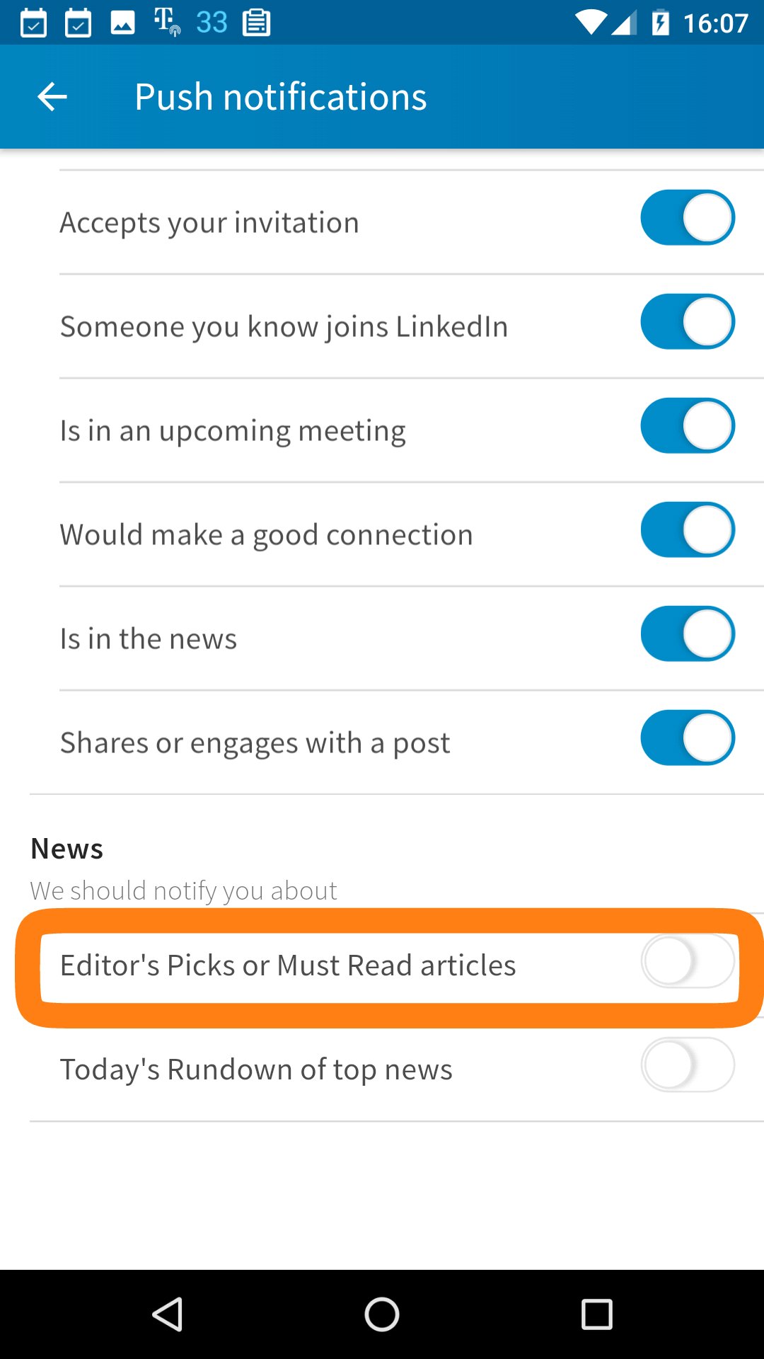
The message in the bottom told me why I received the notification (and what it was- an alert for “Editor’s Picks” articles) and it told me how to change whether I was receiving similar notifications by linking me directly to my settings.
And it did so in a subtle enough manner that it wouldn’t interrupt my experience if I wanted to read the article. And it had an easily identifiable “x” in the corner to dismiss the message.
I wish more apps were that transparent when it came to their notifications. The pop-up message informs the user, helps them make relevant changes if they desire, but, because it’s not required or urgent information, it doesn’t demand the user’s visual attention (i.e., it’s not brightly colored, or in the middle of the screen, or obstructing anything). The user doesn’t need to interact with it in order to continue with interacting the app in other ways, if they don’t want to.
Now, for my wish list. It’s great that that pop-up takes the user directly to the appropriate screen of their settings to make changes to the types of notifications they receive.
However, from a learning standpoint (and don’t you want your users to learn how to use your app well?), it’d be even better if it actually showed you how to get to those settings. The initial pop-up might stay the same, but then, perhaps on the settings page it takes you to, there’d be another pop-up that says something like “to return to this page in the future, go to your profile and then hit the gear icon”. Equip the user, and don’t just solve the issue at hand.
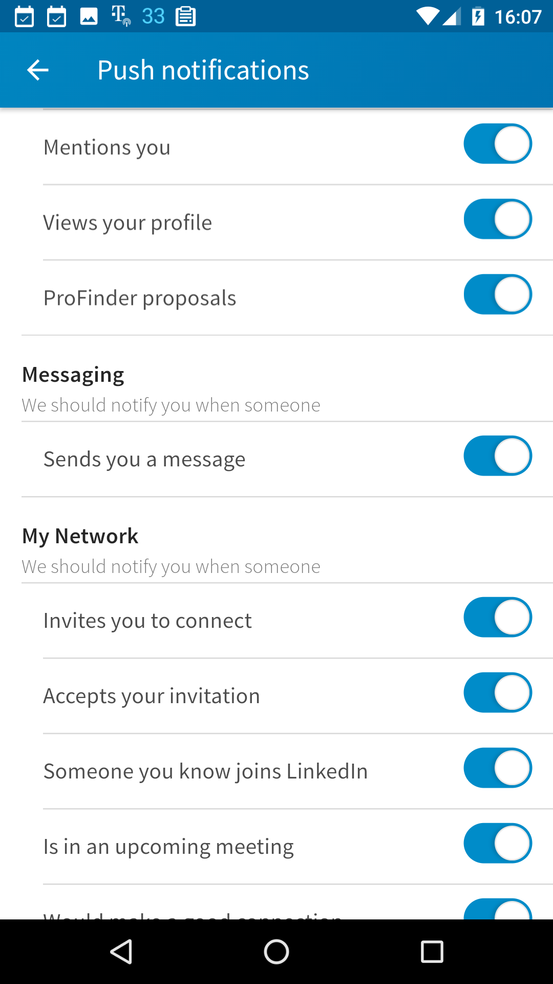
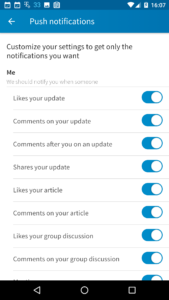
Also, it could be useful, on the notifications setting screen, to highlight the particular type of notification that brought me there, since there are about two and a half pages of types of push notifications.
Luckily, in this case the initial informative pop-up referred to the notification exactly as it appeared in the list.


A mobile app can be a great asset for a social network. Through intentional use of notifications, a mobile app can be used to encourage network members to engage more with the network. But too many notifications will feel spammy and may ultimately lead a user to uninstall the app and therefore participate in the network substantially less than they might’ve without any notifications at all.
Ideally, a social networking app meets its members at the engagement level they’re at, and gets them to increase that engagement. One way to help accomplish that is through appropriate quantity and type of notifications of activity on the network. The notifications need to provide value to the user. And, therefore, the user should be able to disable (or otherwise influence) notifications that do not provide value to them. This allows the user to be an active participant in shaping their experience with with the app/network.
Empowering the user through transparent, consistent design helps the user trust the app and its content. Allowing them to shape their own experience with the app helps them help you (the designer) to make it valuable to them.
Occasionally I’ll highlight a program/app/feature design that I think is interesting or innovative in some way.
Here’s the first of those:
Toca Boca, if you haven’t heard of them, is a company that makes innovative digital playspaces/toys for kids (particularly young ones), in the form of apps for mobile devices.
On the main screen of their apps, there is usually (I haven’t checked all of them) a tiny “For Parents” button in the upper left, and a tiny gear settings button in the upper right.
[both screenshots are from Toca Kitchen]

When you tap either of those, you get a pop-up like this:
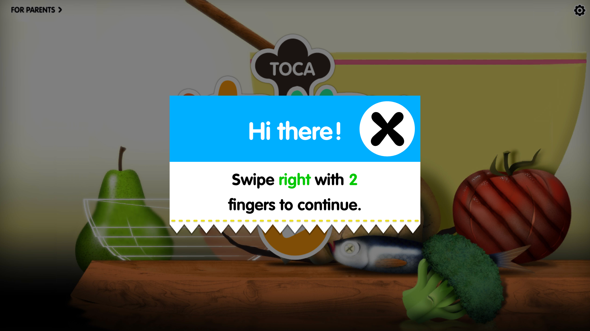 The direction it asks you to swipe in is different each time (up, down, right, left).
Tapping (instead of swiping) anywhere on the screen closes the pop-up, as does swiping with some number of fingers that is not two.
Following the pop-up directions opens up, respectively, information for adults about the particular app, or the settings menu.
This is a simple way to keep little kids from accidentally opening up a screen they can’t read or shouldn’t mess with, without adults having to set up a specific lock.
But it still keeps the information and settings handy for parents if they want it.
It’s a great example of designing for two audiences at once.